IDENTITY SUITE
One company. Four properties. Endless design solutions.
RESEARCH + STRATEGY
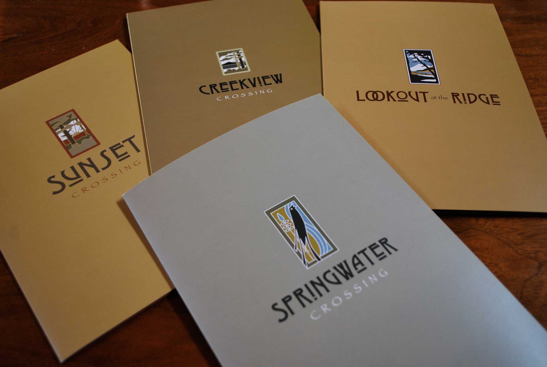
How do you brand several distinct properties, give them their own unique brand identity, and unify the logos to align as a suite of real estate products? This is the design problem we set out to solve for Principal Real Estate Investment LLC. Our client built several properties throughout the Portland Metropolitan and SW Washington area. Each property needed its own brand identity, but the parent company also required that the property logos had some unity in look and feel.
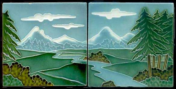
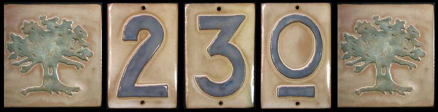
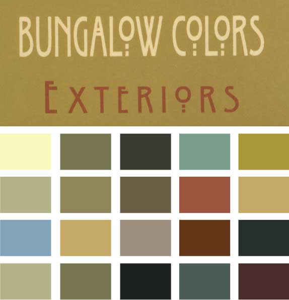
Our design research began with a site visit to Lookout at the Ridge in Camas, Washington. We toured and photographed the entire property, the exterior architecture, and interior details. The craftsmen features inspired us to study historical archives from the arts and crafts era to develop a solid visual strategy. The final colors and concepts were inspired by wallpaper samples, hand painted tiles, and textile designs discovered during our research phase.
STREET MAPS + SITE MAPS
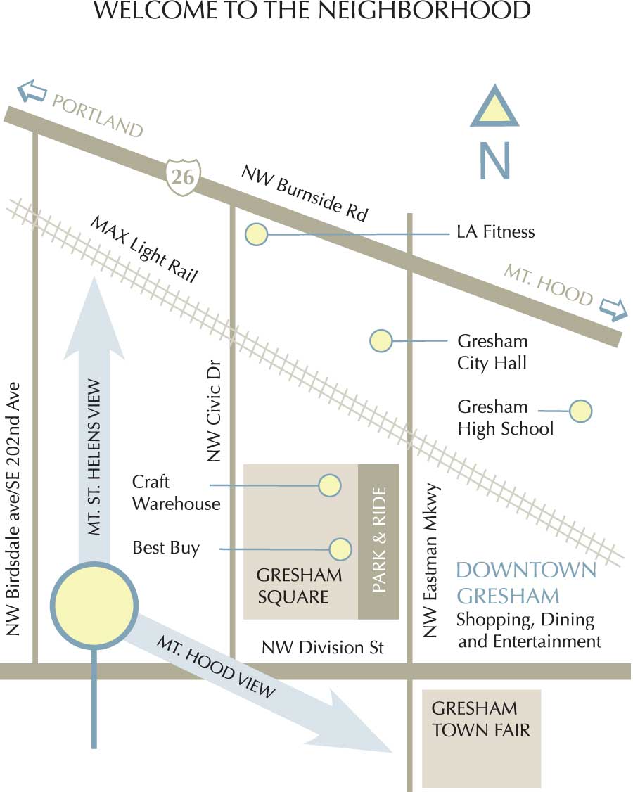
Maps… maps… maps. Ugh! Street maps can be a design nightmare, and we had a bunch to do. Creating a fun, easy-to-navigate map was a critical element in the brand strategy. We are not only selling the property or specific unit, but also promoting the surrounding community as well. Showing (in simple form) where key stores, restaurants, and entertainment are located close by enhances livability and increases brand value.
Running a close second in the “ugh” category are site maps. These are the drawings that show where each unit of the property is located in relationship to the main cross streets, club house, pool, and other amenities. It’s the key piece of collateral that potential home owners study, ponder, and plan over.
So, yeah, these needed to look good.
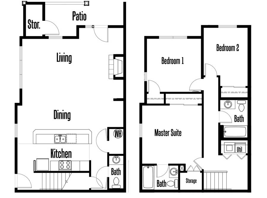
FLOOR PLANS
Our team put their technical illustration skills on overdrive to create the numerous unique floor plans. Working with the architectural renderings, we created clean floor plans in vector that could reproduce beautifully on press. We are now pros at drawing toilets and bathtubs!
“Lewis Creative developed identities, logos, brochures, business cards, letterhead and promotional materials for several separate similar business entities.The work was completed on time, on budget and with amazing results. Comments continue to come in complementing the style, design, and creativity of the products which have been instrumental in setting my business apart from the competition.”
Brad Schnell, Real Estate Management, Investment, Development
PRINT + COLLATERAL
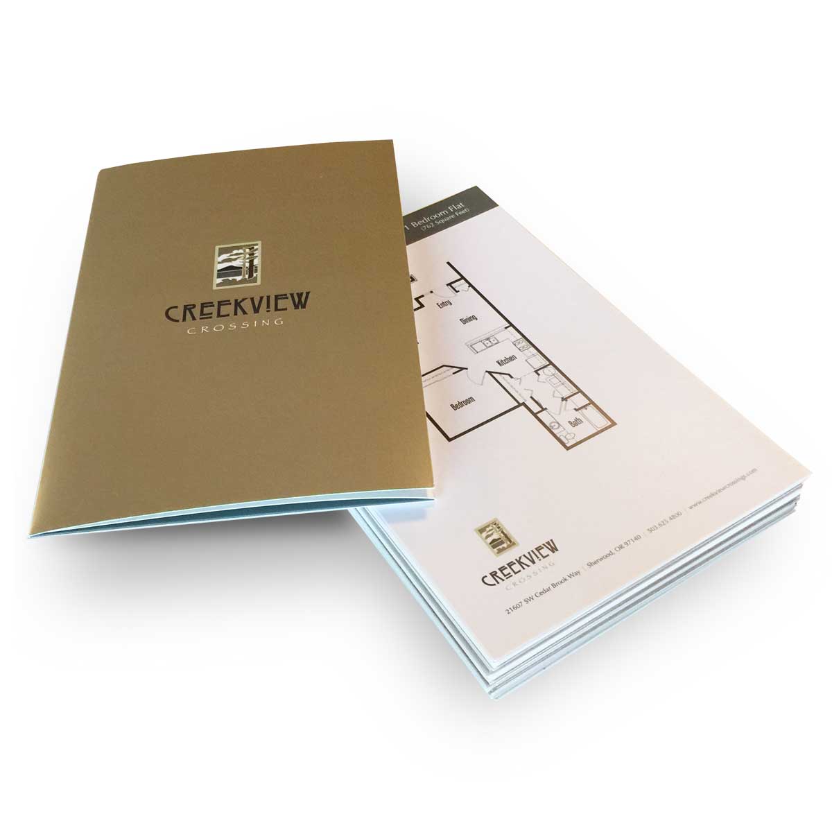
In addition to the standard business collateral, Principal Real Estate Investments needed a sale/marketing piece to reflect the quality and details of their properties. They needed something special
The solution… we created a custom pocket folder/brochure highlighting the amenities, site layout, and community map; plus, hold a business card, a coupon incentive, and multiple floor plans. Each site had the same print components, but each used it’s own branded colors, logo, copy, amenities, community information, and available floor plans. These pieces became an important tool in the sales process, and helped ignite an overwhelming demand for the these properties during one of the lowest housing markets in recent history.
We design experiences. We develop incredible first impressions. Whether you need a logo that inspires, a website that puts your competition to shame, or business cards that wow your prospects, we make you look good.